Fertilisers:
Soil naturally contains phosphorus an element absolutely essential for the growth of plants, including nitrogen and potassium. After growth, through decomposition, these elements are returned from the plants to the soil. However, the cereal crops or grains grown, such as wheat, corn, rice, oats, and barley, are annual crops which must be uprooted, replanted, grown, and harvested every cycle. In regrowing whole sets of crops, phosphorus must continually be drawn from the soil. Historically, the phosphorus contained in the manure of livestock provided an adequate supply of phosphorus. However, natural soil degradation resulted in the need to supplement this supply with the external, non-renewable source of phosphorite. Phosphorite, or phosphate rock, is a finite resource that is formed over millions of years in the earth's crust. 148 million tons of phosphorus is sold every year. Removing these massive levels of phosphorite is an unsustainable practice, and it is estimated that America will run out of its phosphorus supplies by 2040, which will result in large areas of agricultural land having heavy phosphorus deficiencies.
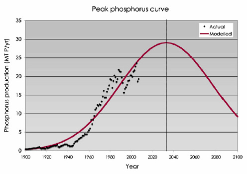
Figure 6 is an area graph which shows the levels of phosphorus and the types of phosphorus being used. As illustrated, the levels of phosphorus coming from phosphate rock is exponentially rising, while manure has only been rising slowly. The contribution of human excreta and guano (fossilised bird faeces) is almost negligible. Even though the levels of phosphorus from manure are increasing, the existing practice is evidently highly unsustainable, with about 15 Million Tons being used every year. This is supported by Figure 7, which shows the projected peak phosphorus production curve. In this graph phosphorus production is estimated to peak in 2030, where it will then decline. This will mean that access to phosphorus will significantly decrease while demand will continue to increase. This will result in a rapid rise in the price of phosphorus, unless demand is able to be met.
Figure 6 is an area graph which shows the levels of phosphorus and the types of phosphorus being used. As illustrated, the levels of phosphorus coming from phosphate rock is exponentially rising, while manure has only been rising slowly. The contribution of human excreta and guano (fossilised bird faeces) is almost negligible. Even though the levels of phosphorus from manure are increasing, the existing practice is evidently highly unsustainable, with about 15 Million Tons being used every year. This is supported by Figure 7, which shows the projected peak phosphorus production curve. In this graph phosphorus production is estimated to peak in 2030, where it will then decline. This will mean that access to phosphorus will significantly decrease while demand will continue to increase. This will result in a rapid rise in the price of phosphorus, unless demand is able to be met.
Figure 6: Historical Phosphorus Supply Sources 1800-2000
Source: Cordell, D., Drangert, J.-O., & White, S. (2009). The Story of Phosphorus: Global Food Security and food for thought. Global Environmental Change, 1-12.
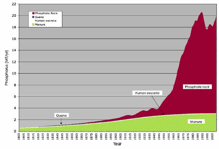
Figure 7: Graph of phosphorus use 1900-2100
Source: Cordell, D., Drangert, J.-O., & White, S. (2009). The Story
of Phosphorus: Global Food Security and food for thought. Global Environmental Change, 1-12.
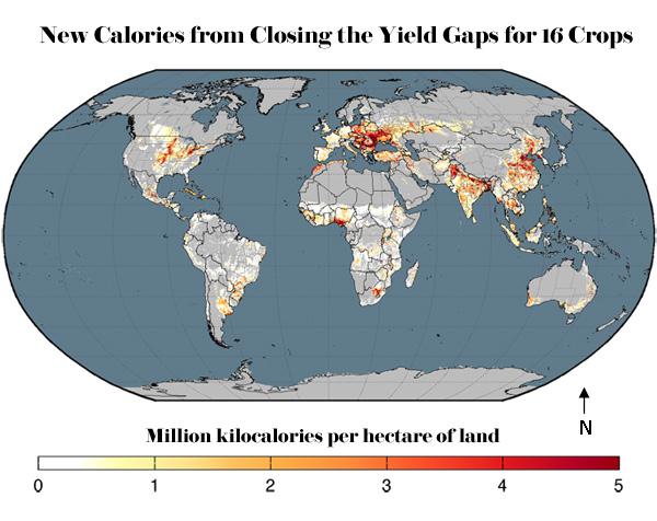
Evidence of the extent to which fertilisers are being used in agricultural practices throughout the world is shown in Figure 8. This scatter plotted choropleth map shows that in areas as such as China, India, the United States and Europe, heavy levels of nitrogen exist, while areas such as the coast of Australia, and in Africa, the nitrogen concentrations are lower. Figure 9, while showing the calories produced per hectare of land, the map shows higher levels in similar areas. China, India, the United States and Europe all are shown as areas which produce food the most efficiently. This draws a direct correlation between excess fertiliser use and food production. Yet, in areas such as Southern India, despite high concentrations of nitrogen in the landscape, yields remain low.
Figure 8: Scatter Plotted World Choropleth Map of Excess Nitrogen Present in Soil
Source: Fischetti, M. (2011, October 12). How to Double Global Food Production by 2050 and Reduce Environmental Damage. Scientific American
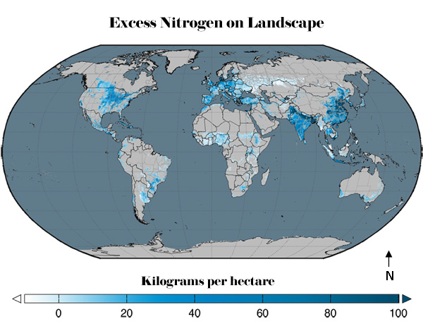
Figure 9: Scatter Plotted World Choropleth Map of Million Kilocalories per Hectare for 16 Crops
Source: Fischetti, M. (2011, October 12). How to Double Global Food Production by 2050 and Reduce Environmental Damage. Scientific American
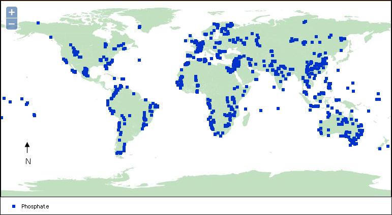
Figures 10a and 10b highlight the extent of phosphate mining throughout the world. The sheer number of plotted points highlights the extent to which phosphate is being mined, providing further evidence of the dire nature of the situation, considering how unsustainable the practice is.
Figure 10a: Phosphorus Mines Throughout the World
Source: Schweitzer, P. (2013, May 16). World Phosphate Mines, deposits, and occurences. Virginia, United States.
| Figure 7 |
Figure 10b: Interactive Map of Phosphorus Mines Throughout the World (Modified Screenshot below).
Source: Schweitzer, P. World Phosphate Mines, deposits, and occurences. Virginia, United States.